Texture
Overview
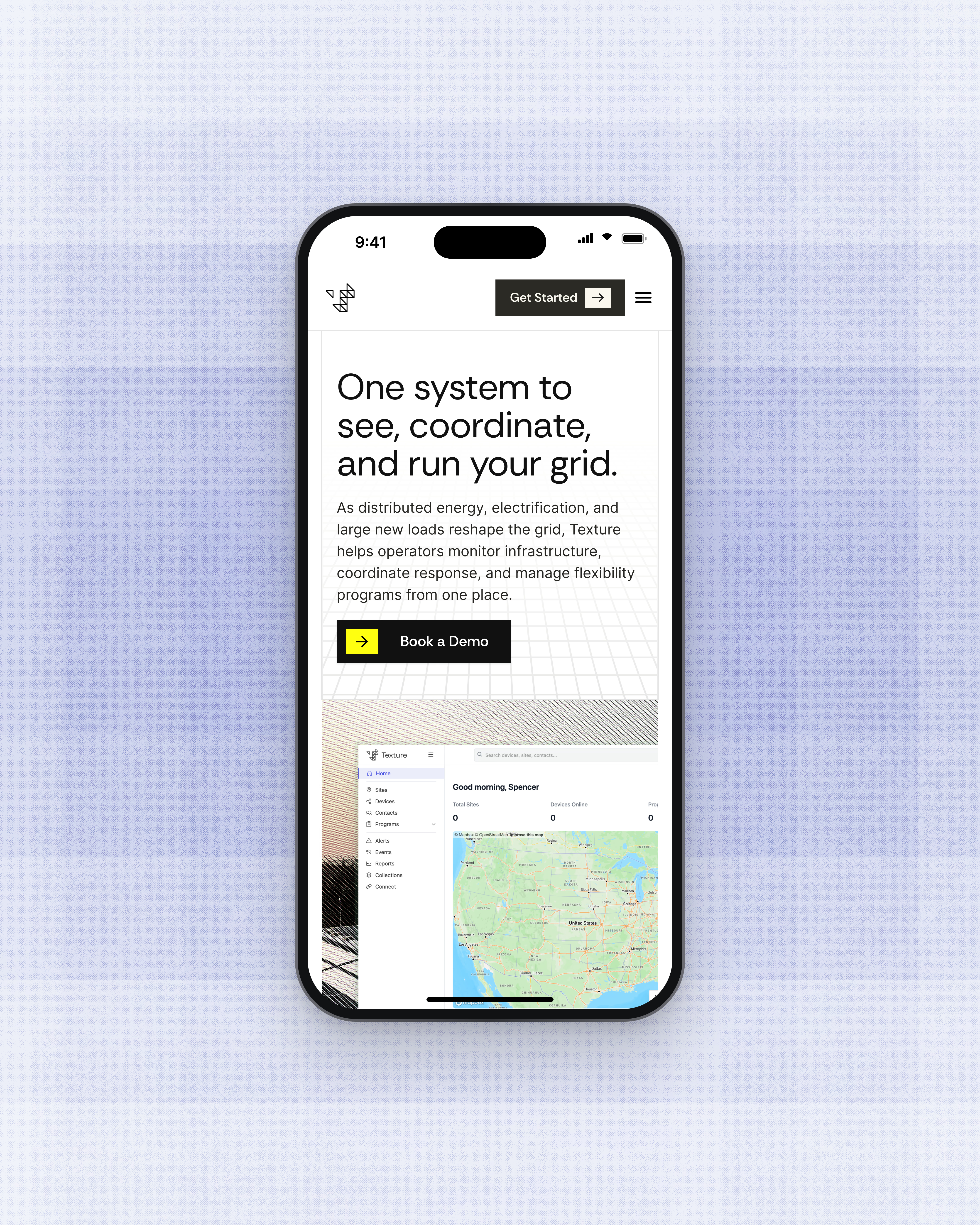
Texture is building the operating system for the grid: one platform that connects the systems utilities already run on and turns scattered data into coordinated action. As distributed energy, electrification, and large new loads reshape demand, Texture needed a website that matched the product it had built. We partnered with the team to clarify its story, sharpen who it speaks to, and design a site that puts the platform front and center.
The Challenge
Grid operators run their work across a dozen disconnected tools (AMI, SCADA, DERMS, billing) and still coordinate with partners by sending spreadsheets back and forth. They are also a deeply skeptical, risk‑averse audience, pitched constantly by vendors who promise to solve everything. Texture’s previous site stayed too high‑level, leaving visitors asking what the product was, how they would use it, and how to buy it. The challenge was to earn the trust of co‑ops, G&Ts, and device makers alike, speaking fluently to both energy people and software people without looking like one more dashboard.
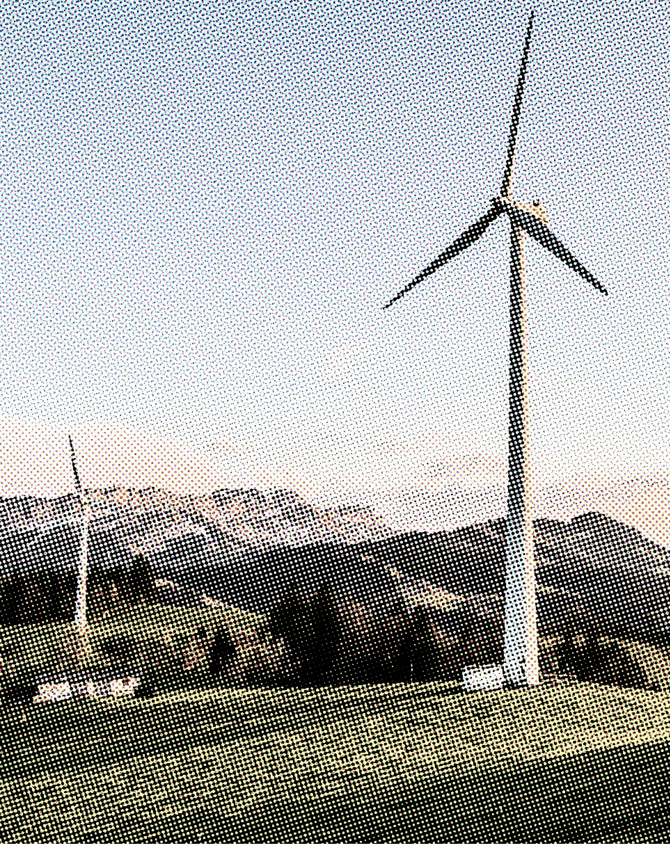
Halftone imagery, a structural grid, and product-first layouts connect complex grid software to the people who keep the lights on. Every section shows the platform at work, so new tools feel trustworthy.

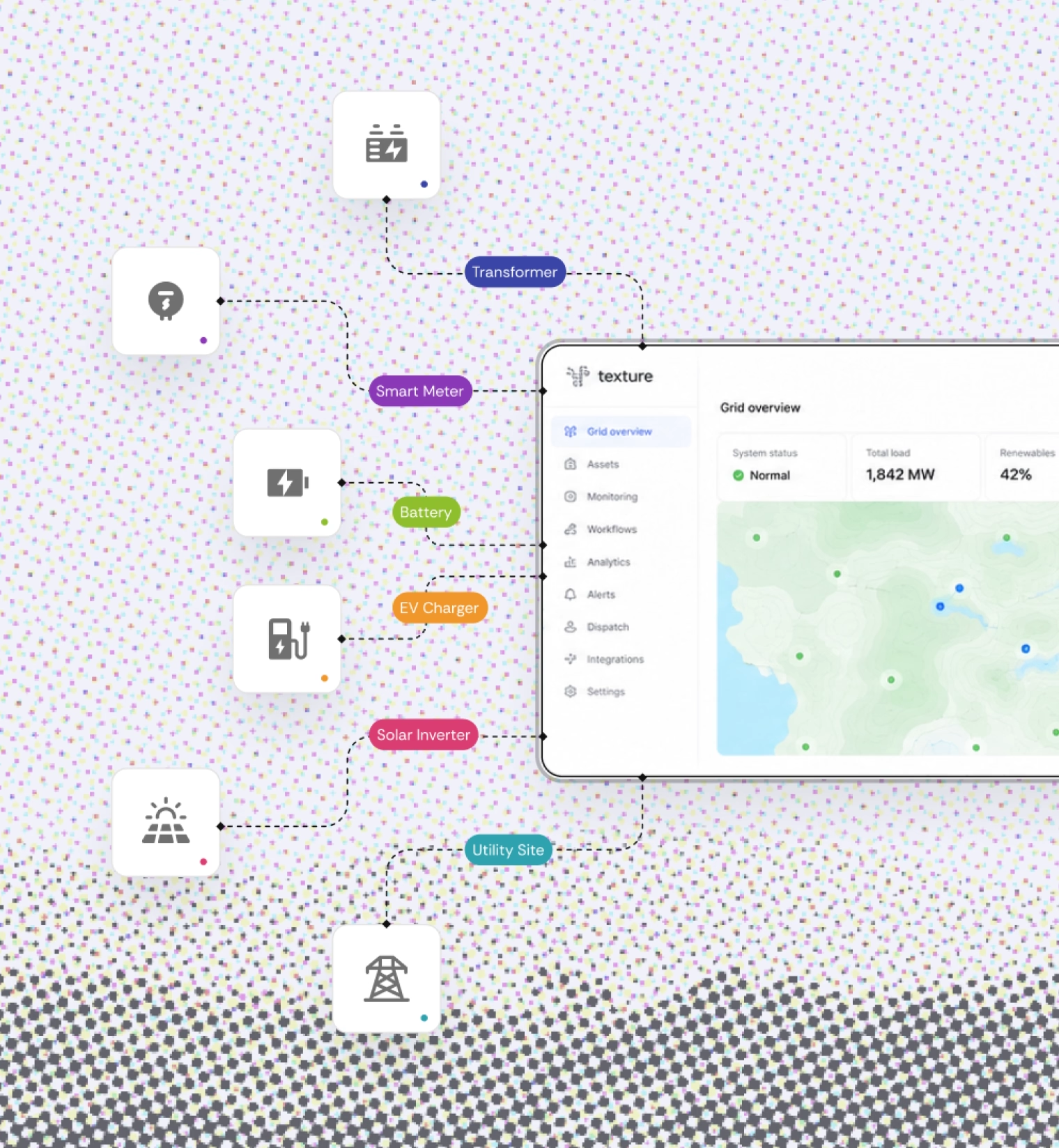
Show the system. Make it feel easy.
The Approach
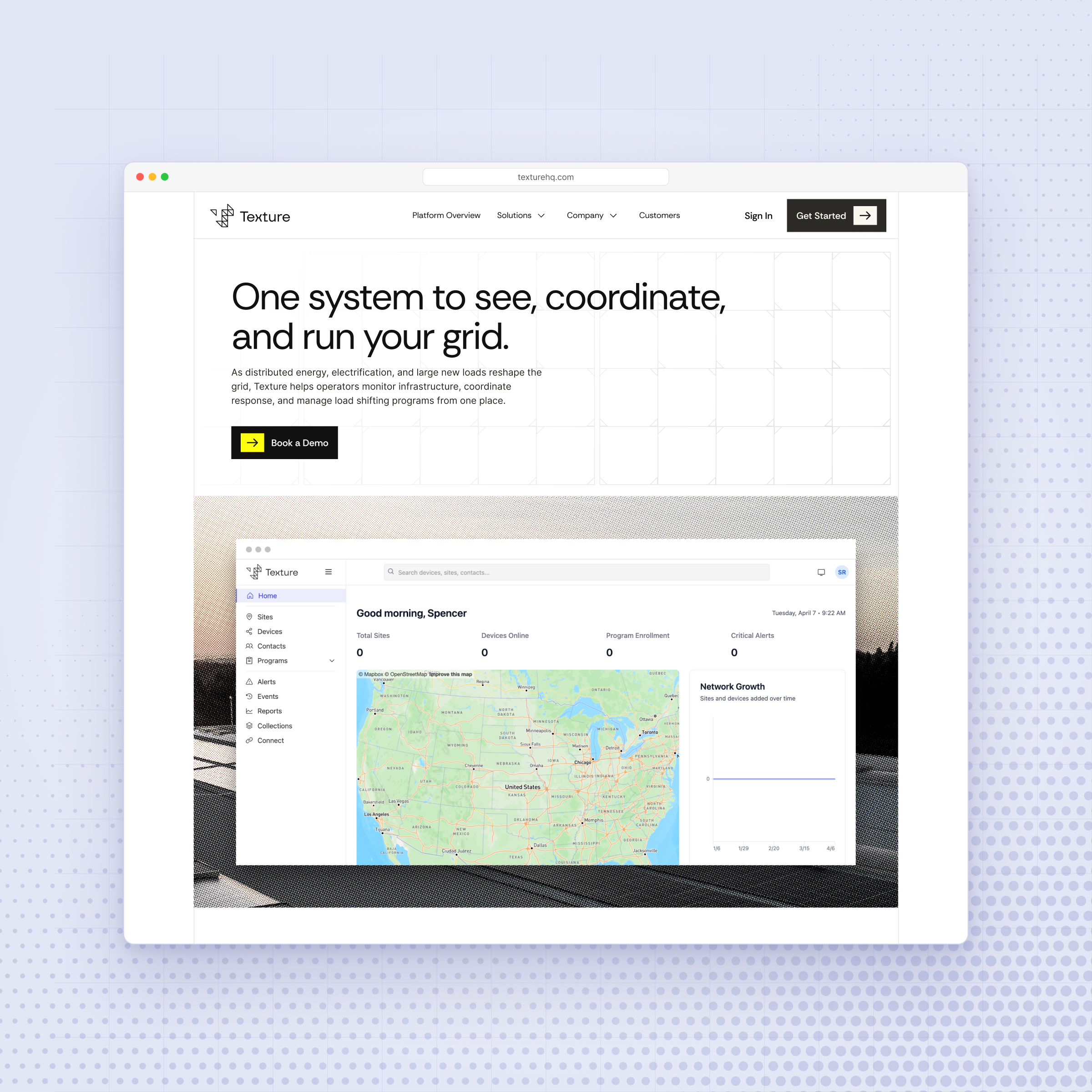
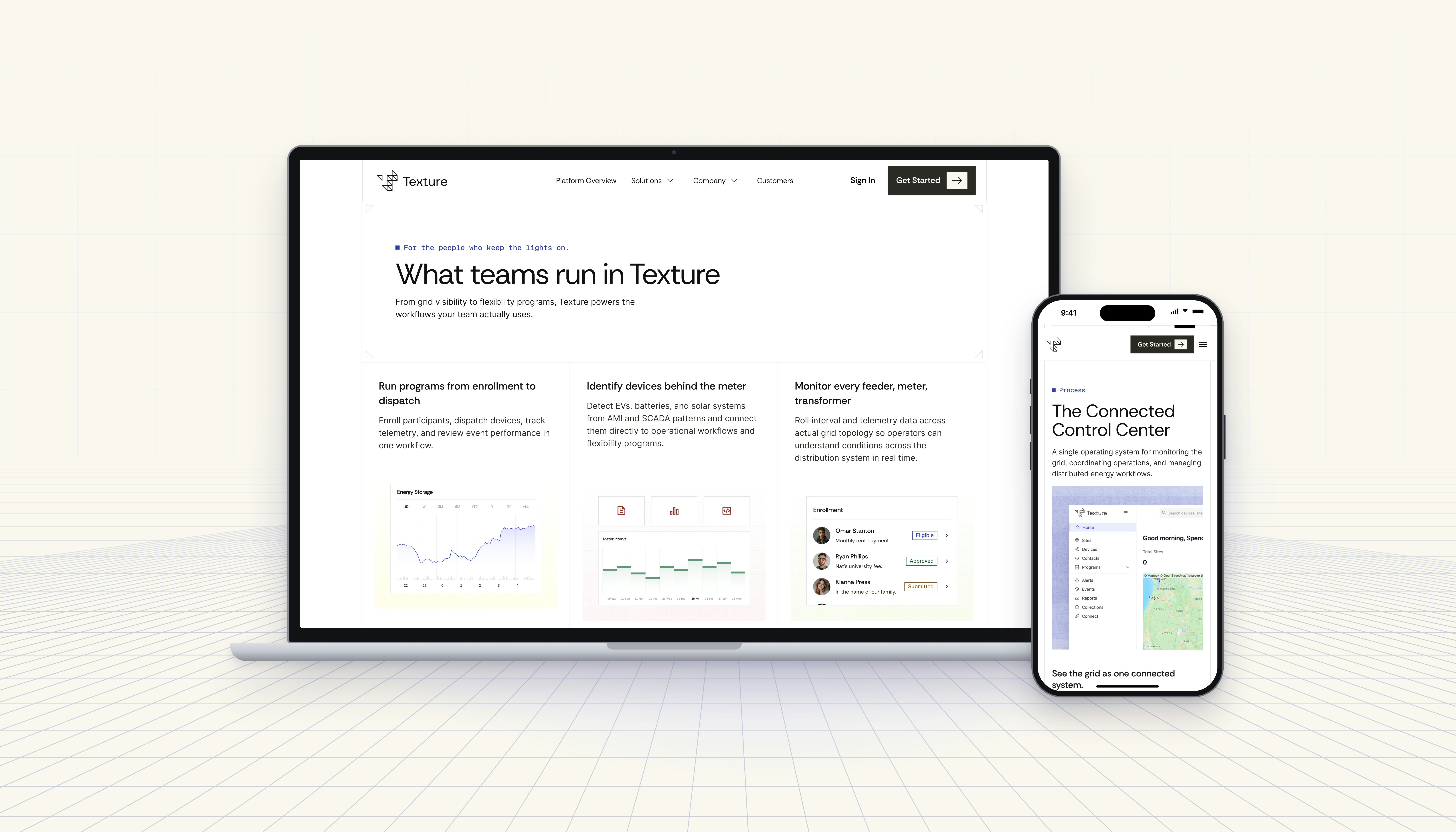
We began with discovery workshops alongside Texture’s leadership, mapping the business, the competitive landscape, and three core audiences: cooperatives, generation and transmission utilities, and OEMs. One principle came out of every conversation: show, don’t tell. Positioning Texture as the software authority rather than an energy authority, we led with the product itself, using real interface views from the control center to program workflows, and organized the site around how the grid actually works, by industry and by use case. The visual language sits deliberately between serious and approachable: clean editorial type, a restrained palette, and well‑timed moments of character in an industry where every brand looks the same.
The Results
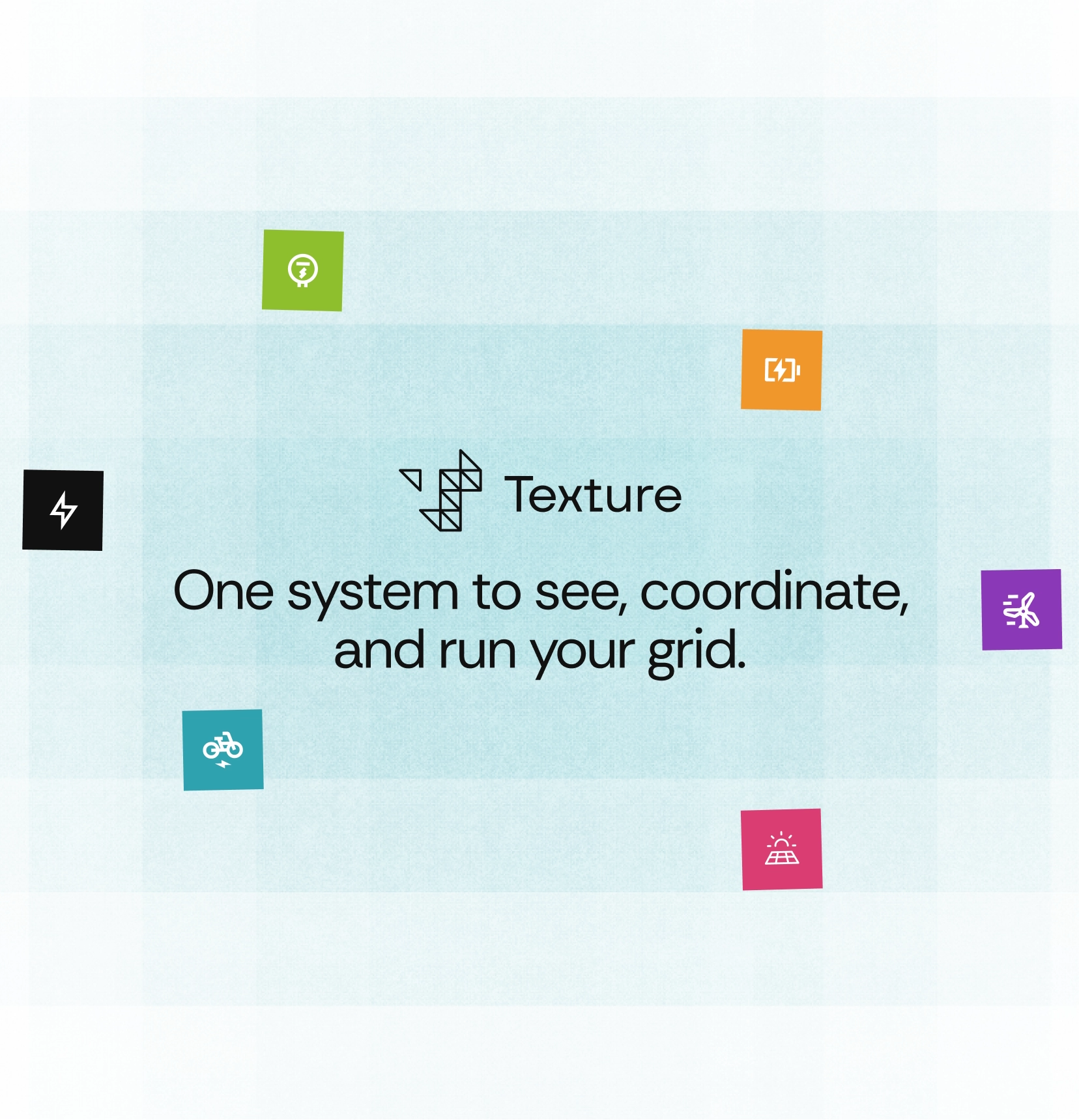
Texture now introduces itself the way operators experience it: one system to see, coordinate, and run the grid. The new site spans the home page, platform overview, about, and careers pages, each designed for desktop and mobile, supported by a shared component library and social share assets. Visitors can see what the product is, how teams use it, and how to get started, with a single clear path to a demo.