Dovly


Overview
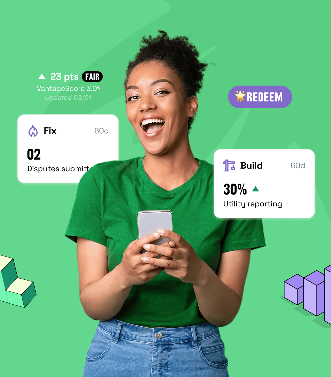
Dovly is an AI-powered credit repair platform that has helped millions improve their financial lives by automating dispute processes and credit monitoring. They had product-market fit and strong partnerships (Visa, Chime, Varo Money). But their website and app experience were fighting against fintech's fundamental challenge: complexity creating friction. Credit repair is inherently confusing—bureaus, disputes, dispute types, timelines. The platform had to translate that complexity into clarity at every step, or users would drop off before achieving results.
The Challenge
Dovly's core innovation is AI that automates credit disputes, powerful but abstract. Users didn't understand what it meant. The lack of a clear onboarding experience didn’t build confidence and the dashboard exposed raw data without narrative. For a fintech product targeting people already stressed about credit, friction at every step meant abandonment. The industry average for fintech onboarding drop-off is 63%. Dovly needed to turn complexity into reassurance.
Credit repair software lives in the gap between what's legally required and what users can emotionally handle. The best designs don't remove the compliance, they reframe it as protection, not friction.

The Approach
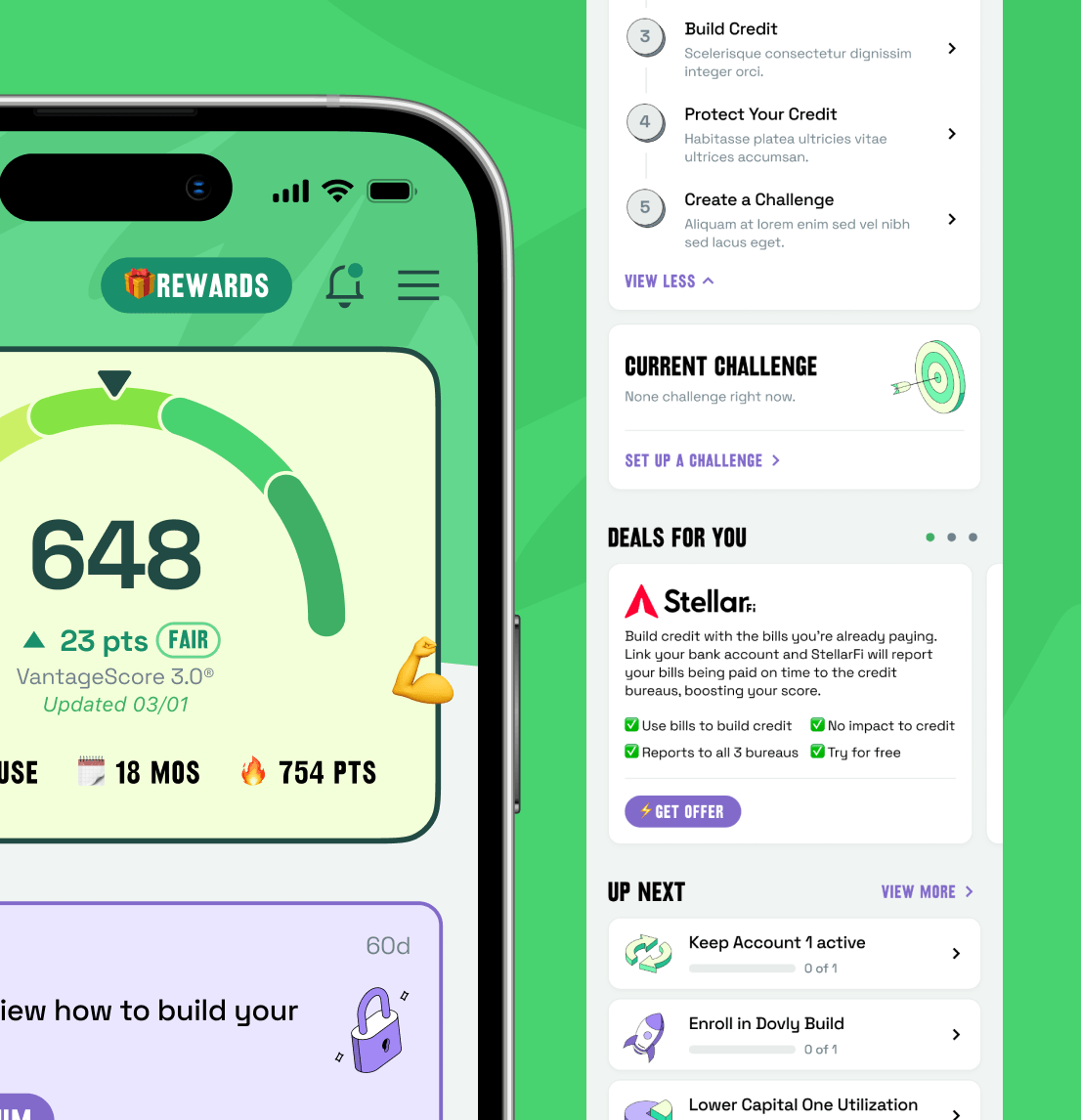
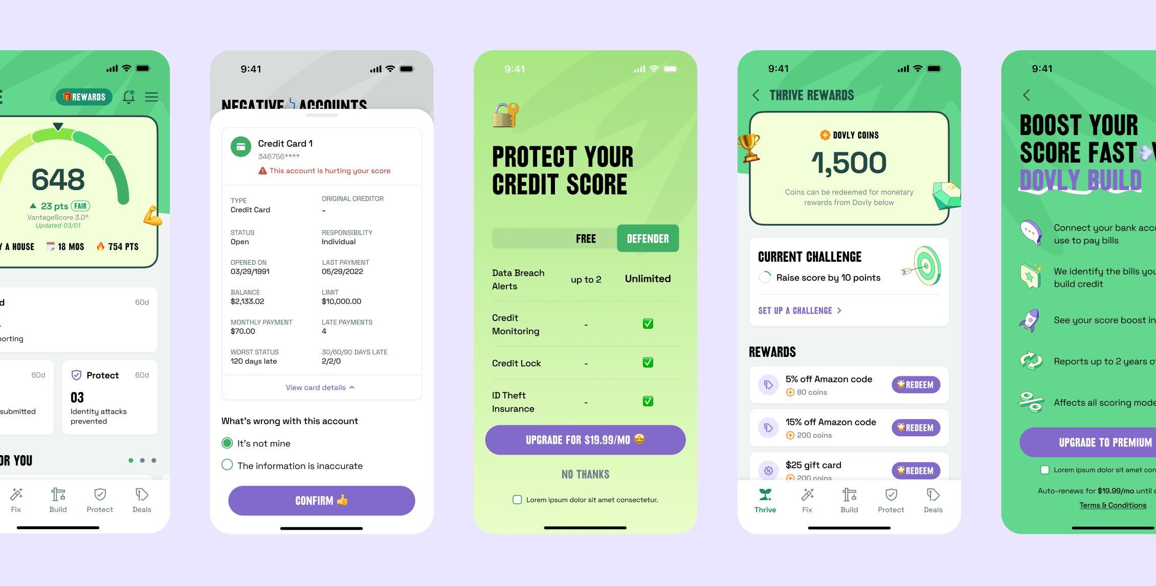
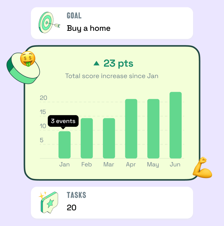
We began with intensive research into user mental models, what scares people, what confuses them, what they need to see to trust an AI with their financial identity. From that, we restructured the entire experience around clarity and momentum. Onboarding was redesigned from form-heavy to story-driven and the dashboard was rebuilt around narrative progression—your report today, your disputes in motion, your victories celebrated. Trust-building was structural, every security measure was made visible through clear microcopy and visual signals. The color system and typography shifted from clinical to encouraging, this wasn't a legal battle, it was a partnership toward financial freedom.
The Results
Post-redesign, onboarding completion rates improved significantly, reducing abandonment below industry average. Mobile app engagement increased as the experience became more intuitive—users who completed onboarding showed dramatically higher app adoption. The dashboard became a destination, not a chore—users revisited to celebrate milestones and track progress. Most importantly, the redesign proved that in fintech, simplicity isn't about hiding complexity, it's about revealing it honestly, at the right moment, with the right framing. Dovly's product could now earn user trust through experience, not just through results.