Soraban
.png)

Overview
Soraban is an AI-powered administrative system built for accounting firms — helping them grow without adding headcount. They came to us mid-evolution: the product had matured, but the brand hadn't. The identity needed to earn trust with enterprise decision-makers while staying approachable for the admins and CPAs using it daily.
.png)
.png)
The Challenge
Soraban's existing brand undersold the product. In a category where most competitors default to binary color schemes and sterile corporate aesthetics, there was no visual language that communicated capable without feeling cold. The identity had to work across two distinct audiences — one evaluating the purchase, one living inside the product — without splitting the difference into something that served neither.
Dual-audience B2B branding is a positioning problem before it's a design problem. The visual system has to carry both reads simultaneously — or it collapses under pressure.
.png)

The Approach
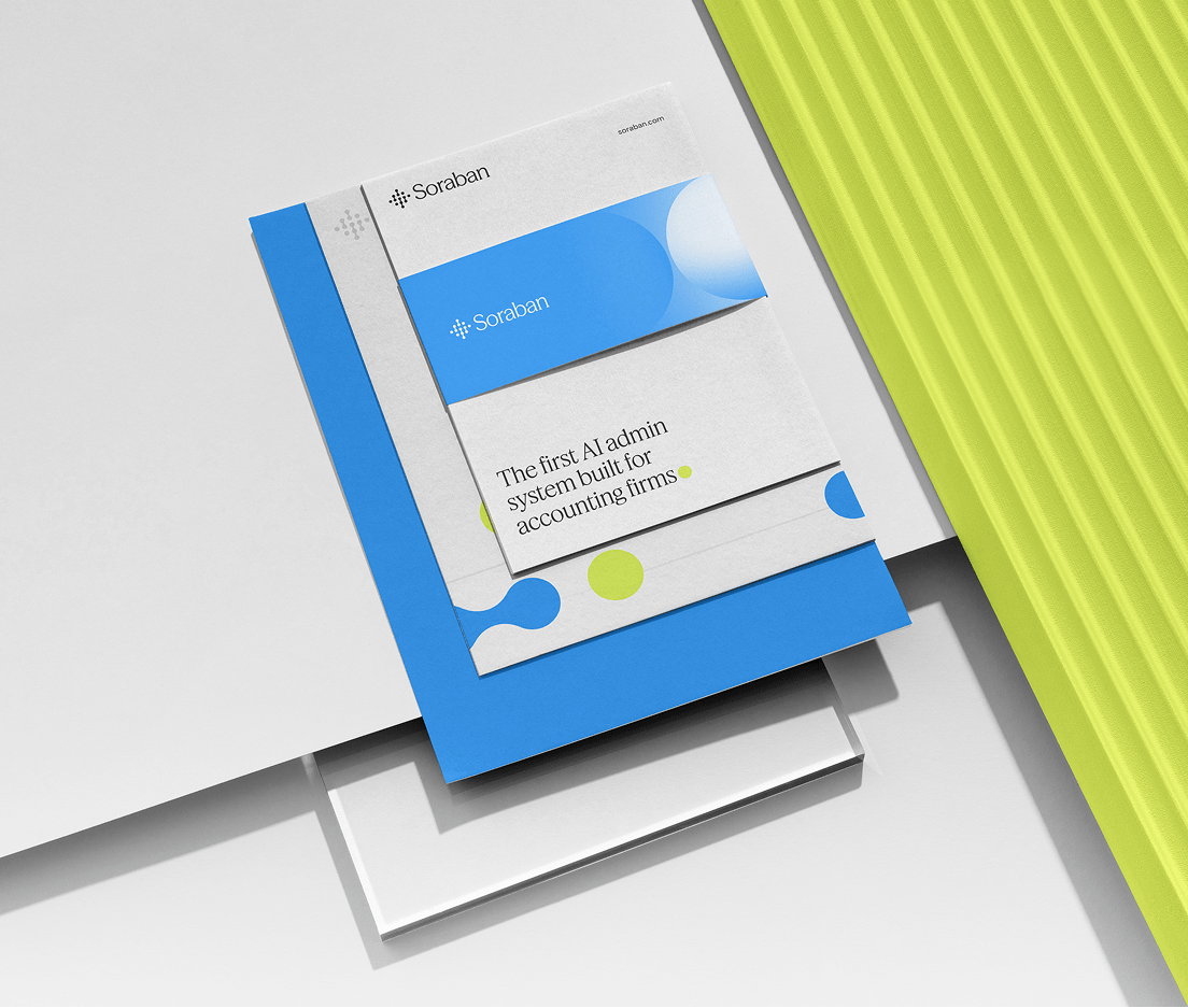
We started with competitive analysis and stakeholder interviews to map where the category was visually flat and where Soraban had room to differentiate. Research informed a clear primary direction: enterprise-polished, lighter in tone, structured without being sterile. The logo exploration centered on circular letterforms — a deliberate nod to the Japanese word for abacus. Color moved away from the binary two-tone approach common in accounting software toward a more flexible, multi-color system. Collateral extended the system into booth, business card, and page templates.
The Results
Soraban launched with a brand system built for both the sales floor and the product interface. The identity gave their internal team enough flexibility to build marketing materials independently — which was an explicit goal from the start. The trade show collateral put the new brand in front of enterprise buyers at launch.
.png)
.png)