Atum
.png)
Overview
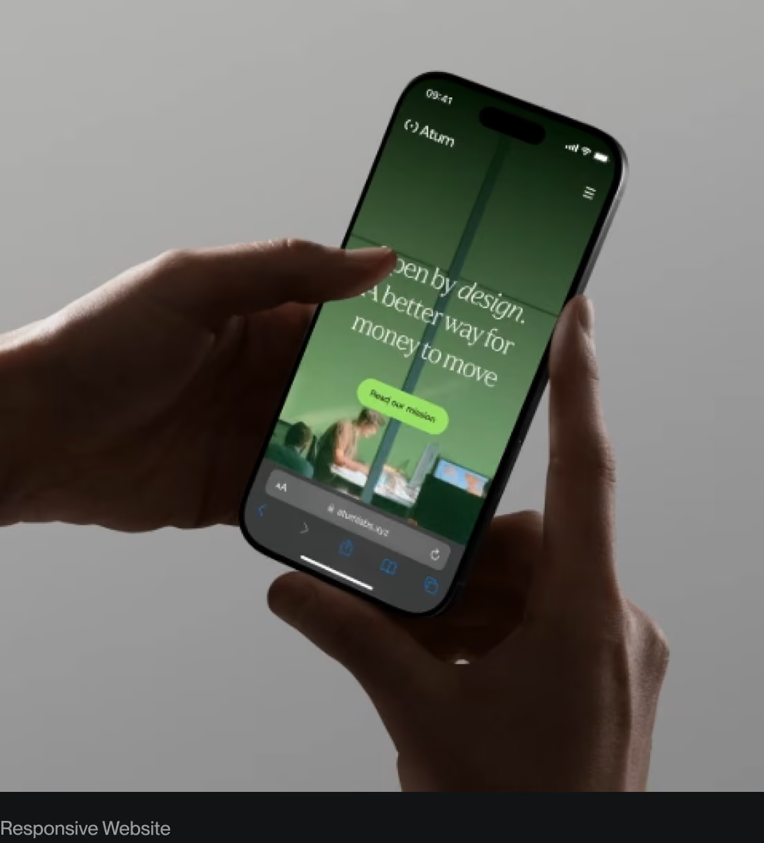
Atum is building an open payments network for global money movement. Its ambition is simple: connect the systems money moves through without competing with the people who use them. With its public debut approaching, Atum needed that idea to become tangible. We worked alongside the team to turn a complex infrastructure story into a distinctive identity, a clear website, and a brand built to last.
The Challenge
A new payments network has to earn confidence before it has a history. Atum needed to speak to developers building on new technology and institutions responsible for moving money. Its neutrality was central: no currency of its own, no favored blockchain, no competing with participants. The challenge was to make that position visible, with enough precision to explain the system and enough humanity to show why it matters.
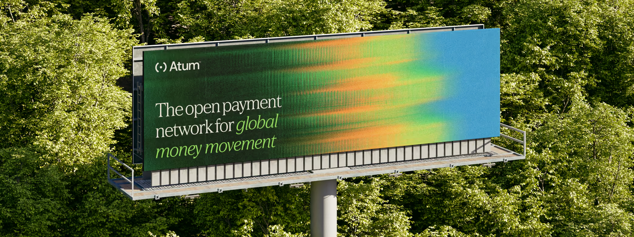
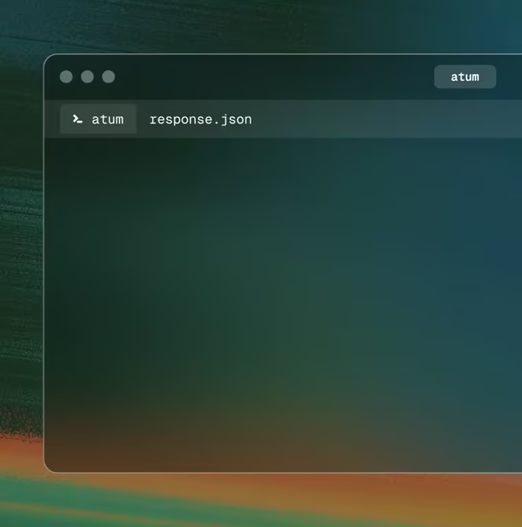
The vibrant palette, surrealist imagery, and measured motion connect an invisible network to the physical world money moves through. Each layer of the brand gives the technology a more tangible presence.
Make the infrastructure clear. Make the ambition human.
The Approach
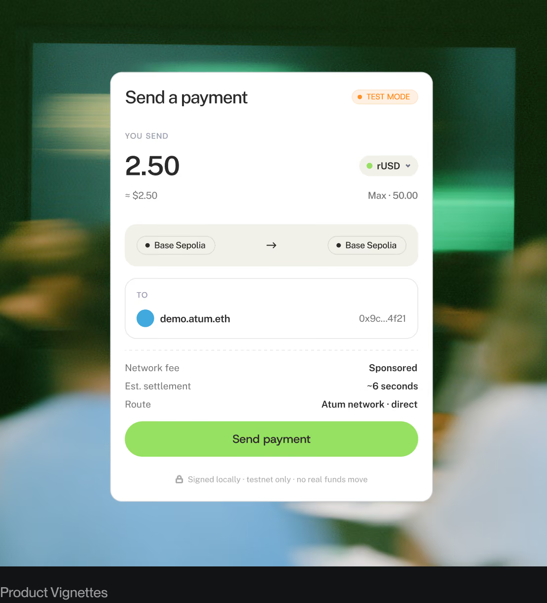
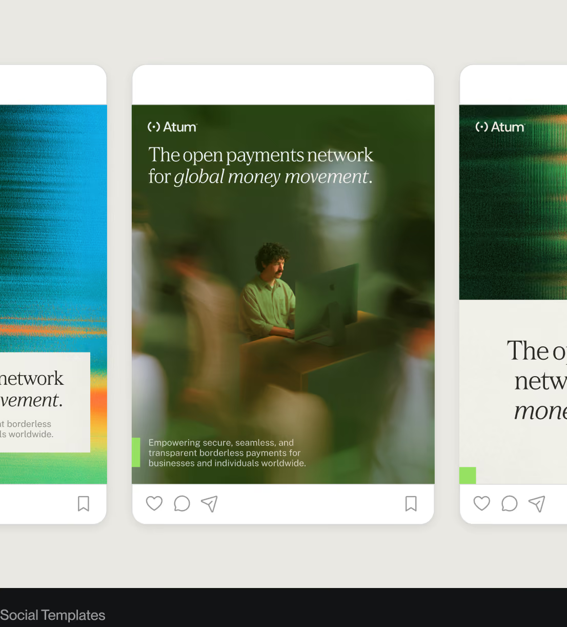
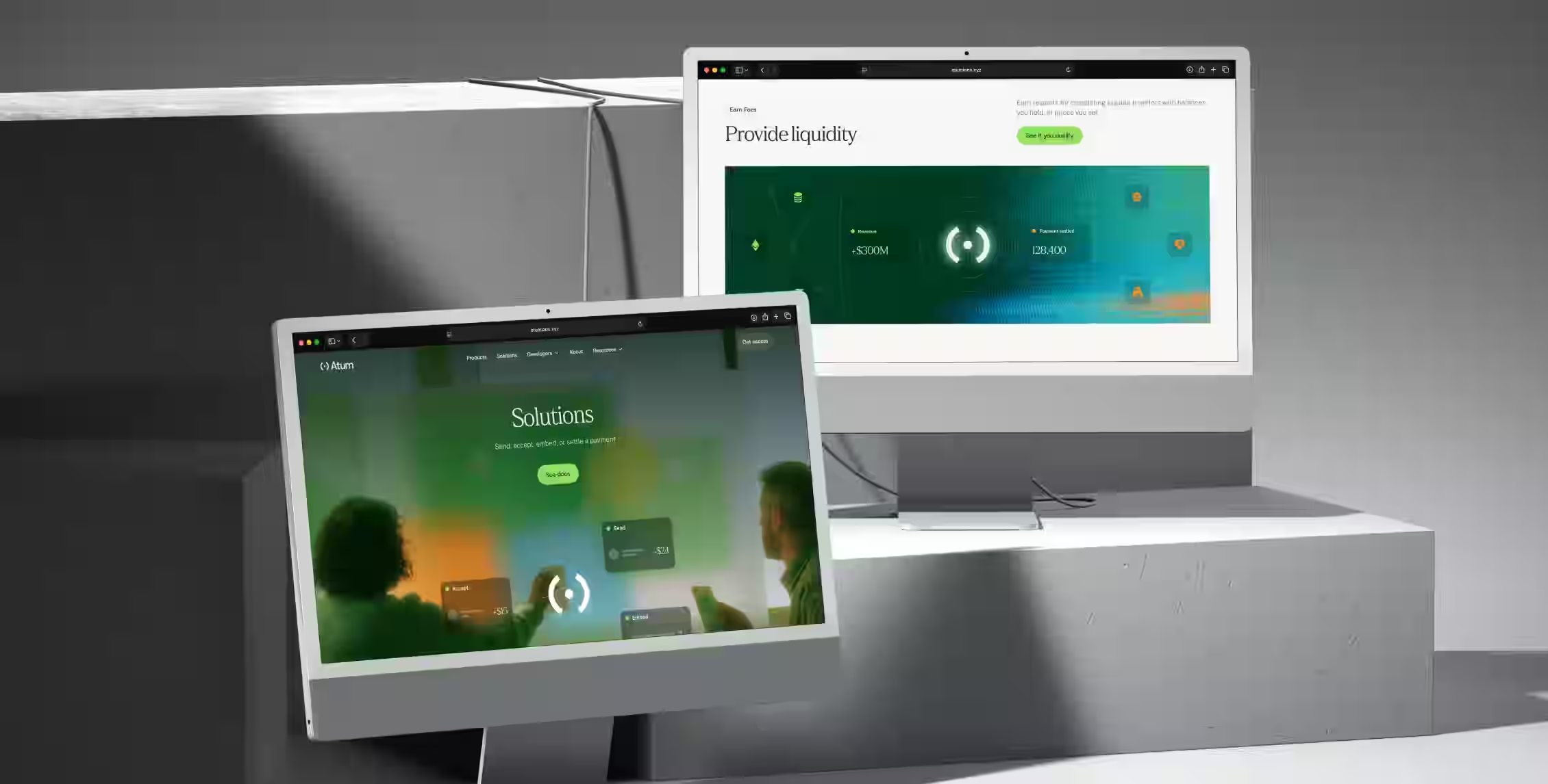
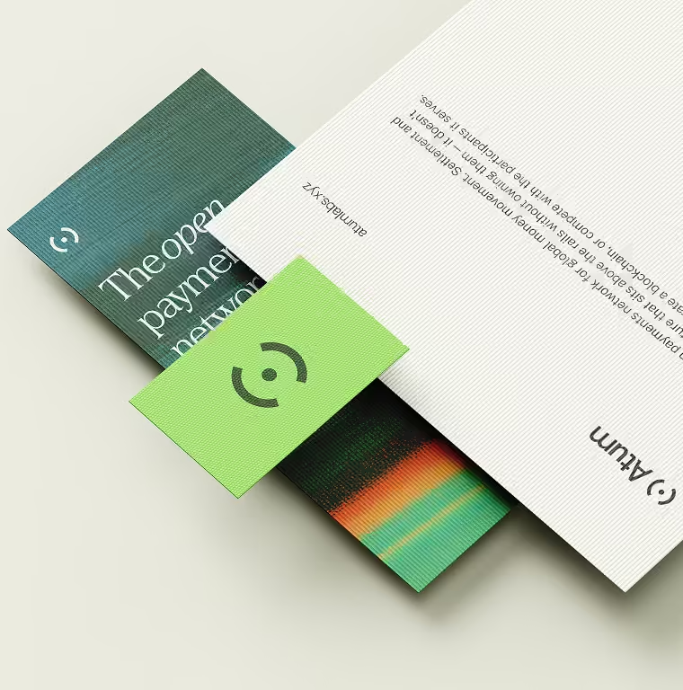
We began with the tension between technical progress and institutional permanence. Building on Abstract Group's positioning, we paired editorial typography with a vibrant palette with a tactile use of color. On the website, payment flows and product vignettes made the mechanics visible. We carried that same thinking into motion, social templates, and collateral, so the brand could explain the network in detail and still feel like one idea.
The Results
Atum launched publicly in September 2026, with a connected brand and website. The identity carries from the first impression into payment stories, product concepts, and launch materials. Guidelines, reusable components, and an AI-ready brand kit give the team a foundation to continue building what comes next. A complex network now has a clear and recognizable way to introduce itself.